ANALYSIS OF OUR FILM POSTERS:
THAHMINA’s POSTER:
Advantages:
- The slogan. By having this it enables our audience to remember our film, also by making it short it stays in the mind and must be catchy.
- The dark background used to highlight the scary mask is effective as it brings out the look of the mask, and suggests that as the audience we are supposed to be looking for a villain who looks like this, yet we know that the villain is not shown until the very end.
Disadvantages:
- It doesn’t include the name of our production, so the audience are unable to recognise our company name.
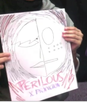
AIMA’s POSTER
Advantages:
- An advantage is the use of both our character’s and the masks face, this suggests to the audience that perhaps Jake is the villain himself, and that he is taking over himself.
- Again the use of a dark background is effective because it embraces the look of the main image in the middle of the poster.

Disadvantages:
- However, something that could be improved is to add a slogan, so that the audience are reminded about the film by remembering something catchy.
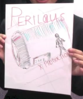
ROHIMA’s POSTER
Advantages:
- An advantage of this poster is that it includes an object from the film, so it gives our audience an insight into the film and an idea of what it will be about.
- Another advantage is the use of the unclear vision of our villain and how the audience have to guess who it may be, creating suspense.

Disadvantages:
- However, the object that is in the film may give too much away, so the audience may already predict the story and perhaps may not find it interesting.
- Also it uses natural lighting, which perhaps does not give it a scary element to the film.
FINAL DECISIONS:
So after looking at all our
posters, we decided on the things we would include in our final poster in order
for it to be successful. It will include:
- A dark background.
- The mask, which is something that is a big part from a film.
- ‘Perilous’ will be placed at the bottom, in a larger font.
- ‘X PRODUCTION’ will be below the title, in a smaller font.
- A slogan will be added at the top in order for the audience to see this first, and will be a lot more intrigued to watch the film.

No comments:
Post a Comment