Sunday, 30 November 2014
Thursday, 27 November 2014
PLANNING 21 - TITLE FONT IDEAS
'PERILOUS' FONT IDEAS
PErILOUS
PRO – It seems as if the writing is drowning out and disappearing relating to the character of our film who is slowly deteriorating.
CON – May be mistaken for a slasher film as it looks like blood dripping.
DaFont – Pulse Sans Virgin
PERILOUS
PRO – As some words are switched around, it relates to the disorientation of Jake’s mind.
CON – For our poster, this may look too long.
DaFont – Times New Yorker
PERILOUS
PRO – As it is bold it will stand out and the bricks can represent his outside journey.
CON – It is too simplistic for our poster.
From all these choices we decided to go with the first option as we believe that it relates to our film the most and the font clearly shows the audience that it is a horror film.
Wednesday, 26 November 2014
Friday, 21 November 2014
PLANNING 18 - REASONS FOR OUR LOCATIONS
REASONS FOR OUR LOCATION:
The Tower Hamlets Graveyard vs. CTC Graveyard
The reason why we
decided to use this instead of the one next to the CTC site is because we found
that the graves were a lot more scattered around the area and made it looked
displaced which creates a disjointed look
to our film. We also wanted to choose this because we found that the way
the trees came over the graves and the bushes gives it a more forest element so
it can link to our intertextuality of ‘The Blair witch project’. Another reason
for the use of this location is because we will be filming in December therefore
it will be a lot darker, which gives the graveyard a mistier and haunted effect
in our film.
The Aspire Sixth Form library vs. The Harley Grove library
We chose this
location instead of the Harley Grove library because we found that if we used
the one in Aspire it would create more continuity in our film because the film
is mostly based around that building. We also chose this library because we
found that the exit doors and the main door is a lot better to capture in the
film and the spacing of the sofa works well within the shot of the doors.
Victoria Park vs. Bethnal Green Park vs. Stepney Green Park
Victoria Park was
chosen because we liked the way there is one huge path. The reason why we like
this is because when we shoot we can capture a lot of angles as the path is big
enough. Another reason why we chose this park is because we found that because
we will we working when the days get darker the bare trees will have a nice
connotation in the film because it could signify the emptiness and loneliness
that Jake is feeling because of all the things that he is facing alone.
Simple Gifts Church
The reason for this
location is because we found that it challenges the conventions of a horror
film, and it gives the element that Jake comes here for safety but in reality
for him nowhere is safe. We also wanted to choose this location because it
showed more of Jakes personality, and suggests to the audience that he likes to
help others which is why he volunteers at the church, and makes the audience
sympathise for him because of how he doesn’t deserve this. We also found that a
church worked well as many people say that this is where the spirits come to
communicate so it suggest that villain is here to perhaps communicate to Jake,
but the audience don’t know why.
Thursday, 13 November 2014
Monday, 10 November 2014
PLANNING 16 - ADV & DISADV OF OUR POSTERS
ANALYSIS OF OUR FILM POSTERS:
THAHMINA’s POSTER:
Advantages:
- The slogan. By having this it enables our audience to remember our film, also by making it short it stays in the mind and must be catchy.
- The dark background used to highlight the scary mask is effective as it brings out the look of the mask, and suggests that as the audience we are supposed to be looking for a villain who looks like this, yet we know that the villain is not shown until the very end.
Disadvantages:
- It doesn’t include the name of our production, so the audience are unable to recognise our company name.
AIMA’s POSTER
Advantages:
- An advantage is the use of both our character’s and the masks face, this suggests to the audience that perhaps Jake is the villain himself, and that he is taking over himself.
- Again the use of a dark background is effective because it embraces the look of the main image in the middle of the poster.

Disadvantages:
- However, something that could be improved is to add a slogan, so that the audience are reminded about the film by remembering something catchy.
ROHIMA’s POSTER
Advantages:
- An advantage of this poster is that it includes an object from the film, so it gives our audience an insight into the film and an idea of what it will be about.
- Another advantage is the use of the unclear vision of our villain and how the audience have to guess who it may be, creating suspense.

Disadvantages:
- However, the object that is in the film may give too much away, so the audience may already predict the story and perhaps may not find it interesting.
- Also it uses natural lighting, which perhaps does not give it a scary element to the film.
FINAL DECISIONS:
So after looking at all our
posters, we decided on the things we would include in our final poster in order
for it to be successful. It will include:
- A dark background.
- The mask, which is something that is a big part from a film.
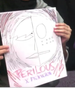
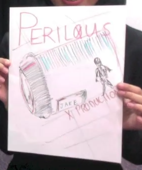
- ‘Perilous’ will be placed at the bottom, in a larger font.
- ‘X PRODUCTION’ will be below the title, in a smaller font.
- A slogan will be added at the top in order for the audience to see this first, and will be a lot more intrigued to watch the film.
PLANNING 15 - SOUND CHOICES FOR RADIO TRAILER
SOUND CHOICES
Static noise would be effective as it shows that there is something wrong happening in the current situation.
The song links to Strauss theory of 'Binary Oppositions' as it is like Old Vs New since we are playing a song from the past decade in a modern film.
This is the tone that we would want our news reporter voice over to have as it is firm and realistic.
Tuesday, 4 November 2014
PLANNING 13 - RISK ASSESSMENT
RISK ASSESSMENT
Hazard
|
Who might be harmed and how?
|
How will I prevent it from happening
|
Crossing over roads to get to places.
|
Both directors and cast
could drop equipment and cause havoc on the roads.
|
We will make sure to
pay attention to traffic lights and when crossing roads, we will look carefully
before crossing. Also, we could try to just stay on one side of the pavement
rather than crossing over to other sides.
|
Inside the Aspire building and on the rooftop.
|
In this situation, the
main actor and the director may be harmed because of anything that may be
lying about whilst shooting.
|
In this case, we will
make sure that there is nothing laying around the place such as bags so we
are working in a clear and organised setting.
|
The public - Park
|
It could harm the
public in case there is any equipment laying around on the floor, which wouldn’t
be professional.
|
To prevent this we will
make sure to keep out belongings organised and out of the way to ensure that
the public are not affected by anything.
|
Props
|
We could be harmed by
things that are lying around for instance we could trip over the fog machine
in Scene 1.
|
We will make sure that
all props are shown to the cast, to make it clear that it is there in order
for no one to trip over anything.
|
Locations - Church
|
In this location, we
could get hurt by anything that the church has left for example if the chairs
are left lying around in a disoriented position, one of us could trip over
it.
|
To prevent this, we
will go to all locations beforehand in order to clear the space so that
nothing is in the way. But we will ask for permission to do this, and put
things back if needed.
|
The weather
|
If the weather is
extremely bad such as extreme winds and heavy rain it will be hard to produce
anything and to control equipment.
|
In order to prevent
this, we will make sure we take a weather check before leaving and pack
umbrella’s etc. so that we are prepared for it.
|
RISK ASSESSMENT FOR CHURCH
Sunday, 2 November 2014
PLANNING 12 - COSTUMES/PROPS
COSTUME/PROPS LIST
PROPS:
- Journal
-Watch
-Note
-Backpack
-Earphone
-Boxes
-Mask
COSTUME:
Johnny - Black clothing
Jake - Lighter shades, green coat, denim jeans, more relaxed clothing.
Film 1 Girls - Feminine colours, winter clothing.
Subscribe to:
Comments (Atom)


